Today I want to talk about how images load on the web. During my interviews when I am hiring I meet a lot of people with many years of experience who lack the foundational understanding of what fires an http request to an image. Images have major impact on two things; Performance and User Experience. Understanding how they load helps you optimize and improve the performance of your applications.
Images in HTML
To start let’s begin with the hello world example that you meet when you start to add an image to a web page:
<img src="path-to-image" alt="A Rose" />
As a rule, everytime the browser encounter an img tag with a src attribute it will attempt to download the image. Even in the following example:
<img style="display: none;" src="path-to-image" alt="A Rose" />
Setting the display to none doesn’t have any impact. A web browser will start to fetch the resouce provided in the src attribute regardless of the display. That’s why showing and hiding images using CSS is a bad idea:
<style>
	@media (max-width: 767px) {
		.desktop-only {
			display: none;
		}
	}

	@media (min-width: 768px) {
		.mobile-only {
			display: none;
		}
	}
</style>

<img class="mobile-only" src="path-to-image" alt="Single Rose" />
<img class="desktop-only" src="path-to-image" alt="Garden of Roses" />
The problem is; this only affects the display of your content. The browser will download the two resources which results in more bytes being shipped down the wire, more bandwidth consumtion and eventually poor performance. To solve that problem we use a different tag called picture. I won’t discuss picture tag in details but I encourage you to check it if you haven’t used it. It’s very well supported, falls back very safely and even there’re polyfills for it.
Of course every rule has exceptions. In the following conditions, the browsers will not attempt to download resources found in src attributes in img tags:
An img inside a template tag
The template tag is part of the web components specifications. Elements inside the template tag are known to be inert which means you cannot select them using document.querySelector, they will not recieve focus and finally they do not fire requests to show embedded content.
<!-- This will not trigger an http request -->
<template id="user-card">
	<p>User Name</p>
	<img src="user-sample-image" alt="User Name" />
</template>
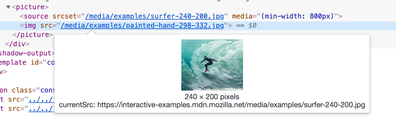
An img inside a picture tag
Inside the picture tag the img tag was used as a fallback for browsers that doesn’t support it but the final version of the specifications stated that the img is required. In case there is a source tag that matches the display condition and it’s different from the one defined in the img tag’s src the browser will attempt to download that resouce and ignore the one defined in the img tag:
<!-- If the media matches the condition, the browser will not download
	the resource defined in img tag -->
<picture>
    <source srcset="desktop-image" media="(min-width: 800px)" />
    <img src="mobile-image" alt="Rose" />
</picture>
An img tag with a srcset attribute
This example is taken directly from an MDN article about responsive images. The attribute srcset can be used to load images according to the resolution of the screen and / or the available area to display the resource. In the following example, only the filed called elva-fairy-640w.jpg will be downloaded if the user is using a retina screen.
<img srcset="elva-fairy-320w.jpg,
             elva-fairy-480w.jpg 1.5x,
             elva-fairy-640w.jpg 2x"
     src="elva-fairy-320w.jpg" alt="Elva dressed as a fairy">
⚠️ Note that all these exceptions happen when the browser supports template, picture tags, sizes and srcset attributes . Otherwise they will be ignored and the img will be treated as it should.
Now because sometimes the img tag displays an image different than the one used in its src, the browsers development tools like Chrome display the currentSrc like the following:
Images in CSS
Unlike images in HTML, images referenced in CSS are not downloaded until the elements get their style calculated and rendered. An element with a background image should have its style calculated first then the browser will attempt to download its background image. For example:
<!-- This image will be downloaded because the element is rendered. -->
<p style="background: url(img-1.png)">Content</p>

<!-- This image will not be downloaded because the parent element has its display set to none. -->
<div style="display:none">
	<div style="background: url(img-2.png)"></div>
</div>

<!-- This image will be downloaded because the element's style still have to be calculated.
	The behaviour isn't consistent across the browsers
	though -->
<div style="background: url(img-3.png); display: none"></div>

<!-- This image will be downloaded because the element's style is calculated -->
<div style="background: url(img-4.png); visibility: hidden"></div>
Now to another interesting behavior when using @keyframes to change background images. The browser will attempt to download the image once according to the timing where that image is requested. Check the following pen where we change 6 background images over 50 seconds:
See the Pen dyypxvQ by Ahmad Alfy (@ahmadalfy) on CodePen.
If you check the network tab in your development tools, the chart for images download will look like the following:
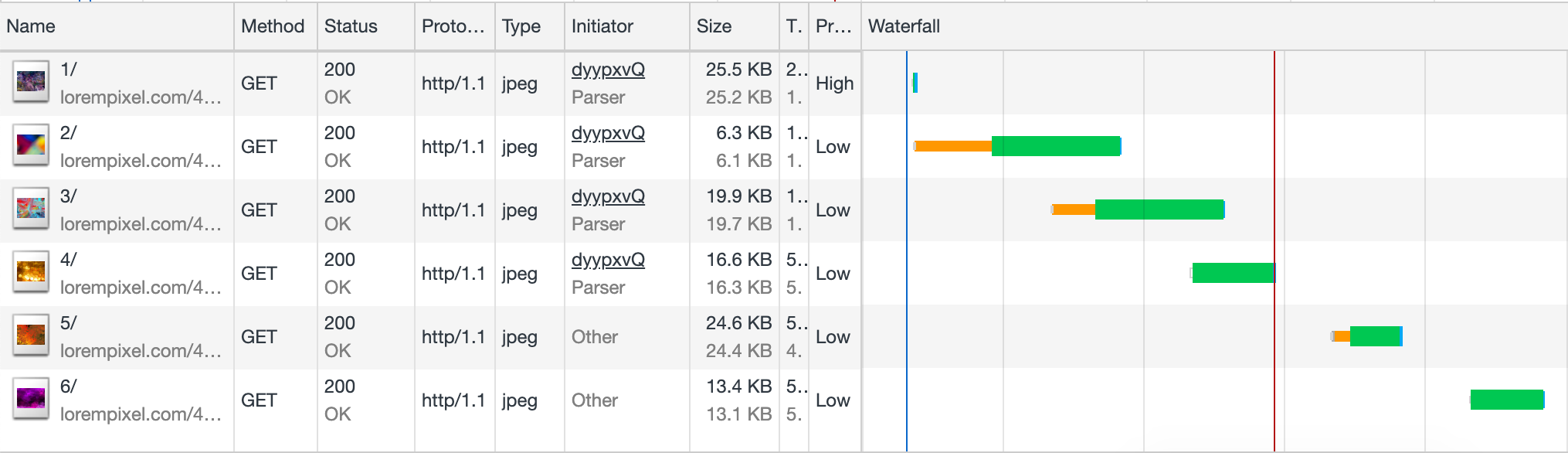
Loading images that way will show flickering when the time comes for the background change. This happens because the browser will start to download the image when its time comes which takes time resulting in poor user experience. This is similar to trying to show background image on hover like the following
<style>
	a:hover { background-image: url(img); }
</style>

<!-- the image will start to download only when the user move the cursor over the link -->
<a href="link">Click here</a>
The image won’t be downloaded until the user trigger the hover. This delay will again result in poor user experience. To overcome that problem we use some techniques we call image preloading . One of the surprising techniques I discovered one of my colleagues is using was setting the background image size to zero! Check the following:
<style>
	.element { background-size: 0 0; }
	.element:hover { background-size: cover; }
</style>

<div class="element" style="background-image: url(image-1.png)"> ... </div>
<div class="element" style="background-image: url(image-2.png)"> ... </div>
<div class="element" style="background-image: url(image-3.png)"> ... </div>
<div class="element" style="background-image: url(image-4.png)"> ... </div>
The browser will download the images yet they won’t be displayed. It’s brilliant that we can do that now.
Images in JavaScript
Just like the img tag on HTML, they simply can’t wait to make requests. Creating an image using JavaScript and setting its src attribute will trigger the browser to download that src even if it is not appended to the document. This has actually one of the oldest technique people used to preload images on the web.
const img = document.createElement('img');
img.src = 'img.png';
Now let’s check this example, it won’t trigger the download:
const div = document.createElement('div');
div.style.background = 'url(img.png)';
Only after the element is added to the document and gets its style calculated the download of the image will start.
Lazily loading images
Using JavaScript
Due to the fact that img tag will trigger the browser to download immediately, we needed a way to delegate loading the images till they’re visible in the viewport. This technique is called lazy loading. It involve using an img tag without a src attribute. Commonly another attribute like data-src is used to hold the URL to the image. Once that images comes in the viewport, JavaScript sets the src to the value supplied to the data-src and the download start. The main problem with that technique is related to SEO because the images doesn’t have its src attribute set so crawlers can’t index it.
There are several libraries created to solve that issue. My favorite is verlok/lazyload because it’s very light as it uses the intersectionObserver API. You can check more examples and techniques on this article by Google.
Native lazy loading
Earlier this year, Addy Osmani published an article about native lazy loading being supported in Chrome behind a flag. All what you need to do is to use a loading attribute like the following:
<img src="img.jpg" loading="lazy" alt="Roses" />
According to Addy:
The loading attribute allows a browser to defer loading offscreen images and iframes until users scroll near them. loading supports three values:
- lazy: is a good candidate for lazy loading.
- eager: is not a good candidate for lazy loading. Load right away.
- auto: browser will determine whether or not to lazily load.
Lazy loading is still in early development and is currently supported in Chrome.
Further readings and references
- Building the Google Photos Web UI this magnificent article by Google discuss the different techniques they use to deliver Google Photos. The whole article is full of useful information and section 4 - Instantaneous Feel - discuss images loading techniques.
- Use lazysizes to lazyload images.
- Native lazy-loading for the web - Browser-level native lazy-loading is finally here!
- Serve responsive images.
- Responsive images - A comprehensive article by MDN.